Lightroom Classic can make a winter scene look clean and accurate, but that is not always the look you want. If your snow scenes keep feeling bland or strangely “digital,” this edit shows how to use white balance and local control to push mood without wrecking the file.
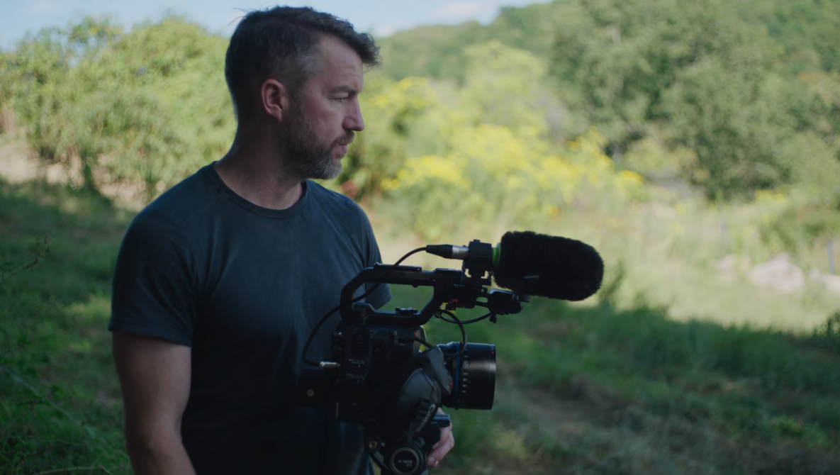
Coming to you from Christian Möhrle, this helpful video starts with a decision that quietly affects everything else: the profile. Möhrle switches from Adobe Color to Adobe Standard to reduce contrast before doing any serious shaping, which gives fog and haze more room to breathe. Then exposure goes down on purpose, not as a dramatic stunt, but as a base tone choice that makes the scene feel heavier right away. He checks the histogram and uses that headroom to keep the dark areas from clipping while still making the frame look darker. After that, he pulls contrast down further, then lifts shadows and blacks to keep the scene from collapsing into mud, which creates that “fog has depth” feeling without adding fog.
White balance is the main lesson, and it is more deliberate than the usual “make snow white” approach. Möhrle shows how a neutral correction would work first, warming the image until the color cast settles and the snow reads closer to true white. Then he rejects that neutral look and steers back toward cold, keeping blue present but not overpowering, especially in the shadows. You also get a practical way to judge the cast when you feel uncertain: briefly push vibrance and saturation way up so the tint becomes obvious, then reset and make smaller moves. The interesting part is not “cooler equals moodier,” it is how he limits the blue so it lands where it helps, instead of coating the whole frame in cold color.
Once the global tone is set, masking turns the edit into something intentional. He darkens the top of the frame with a linear gradient, then repeats it on the near foreground, creating a natural vignette that nudges attention inward without looking like a filter. Next he builds a radial gradient for a soft light area on the left, and he places the center outside the image to make the light feel like it is spilling in from off-frame. Inside that mask he raises exposure gently, controls highlights so the bright patch does not scream, and drops dehaze to thicken the air where the “light” hits. He also cools those highlights locally if they start reading warmer than the rest of the scene, which is one of those small fixes that keeps the mood consistent.
The foreground work gets more specific, and this is where you may want to slow down and watch how he builds selections. He uses a landscape-based selection for snow and ground, then subtracts a gradient so only the upper part of the foreground gets lifted, which adds depth without turning the closest snow into a white slab. He lowers contrast inside that local adjustment to brighten while protecting highlights, then corrects local warmth with a small temperature move instead of undoing the global look. He repeats the snow and ground selection, intersects it with a radial gradient, and boosts whites in a focused area to guide the eye more precisely. He also targets the trees with a vegetation selection and tightens them with darker shadows and a cooler tint, but he warns you to stay careful because those masks are never perfect. Check out the video above for the full rundown from Möhrle.


 English (US) ·